


Defining Regime Changes and Understanding Their Linkages
Sunday, March 10 Markets and Macro

Summary
On Friday, I wrote about economic regime changes and how I believe these changes should help discretionary investors and hurt systematic investors. Regime changes are a nebulous and complex term, so I thought it would be helpful today to try to define what I mean and to show how different aspects of the market change in the aftermath of a regime change.
Today, I first define an economic regime change before showing how I measure the beginning of a regime change. Using this methodology, I then chart the post-World War II period and discuss all “economic regimes” since 1945. Finally, I show that we are in a new regime and I attempt to predict what this environment will be characterized by.
Building on Last Week
Defining “Regime Change”
To quantitatively and rigorously measure my theories on regime changes and alpha, we must first define a “regime change.” I believe economic environments are defined by a significant shift in the principles, correlations, structure, and returns of the market. “Strong” economic regime changes are those that pertain to huge changes in the global macro economy—global wars (World Wars), new trading systems (Bretton Woods), currency developments (Euro), and the development of new markets (China). Large-scale changes like this occur extremely infrequently and I believe understanding them is more of an economic history problem than a quantitative macro one. For the purposes of this, I will focus on smaller-scale “weak” economic regime changes. Weak economic regime changes occur every 10-20 years and usually lead to fundamental changes in correlations and returns of asset classes. For example, in the 1970s, stocks and bonds became correlated under the “regime” of stagflation after previously having been uncorrelated.
I believe economic regimes are any broad-scale change in market returns and correlations and they can be measured as starting during periods of excessive variance. From Friday’s piece:
I’ve previously explored the idea of variance time and variance as information here. The higher the variance in markets, the more information is being digested by them. Variance exists precisely because new information is being incorporated into markets. Not all time is weighted equally in markets—times with higher volatility are periods when more information is digested. Moreover, higher variance periods tend to precede new regimes—that’s why there is volatility!
Thus, periods of high variance should precede market regime changes and should predict changes in correlations and returns. However, it should be extremely difficult for models to predict exactly what will change—they can likely only predict that things will change. I believe the discretionary investor, with greater flexibility, will be better positioned to understand how things will change.
So, today I am going to explore all high volatile periods since World War II1 and determine how returns and market dynamics changed in the five years following the high variance periods:
Below I chart average monthly volatility in the S&P 500 by year, noting the top 90th percentile of years are years in which average monthly volatility was above 5% (Figure 1). This corresponds to 5 high-volatility periods with one being significantly less extreme than the others.
Figure 1: Years with Average Monthly Volatility > 5% are in the Top 90th Percentile

High Volatility Period 1: Starting in 1974
Following World War II, a period of general peace and economic growth began. The S&P 500 roared from $13.33 to $97.54 (Figure 2). In the 11 years before 1974, stocks and bonds were negatively correlated (Figure 3). In 1973, the Yom Kippur War led to an oil embargo which triggered an inflation acceleration (Figure 4). In response, volatility spiked upwards (Figure 5).
Figure 2: S&P 500 Climed Upwards in the Post-War Era

Figure 3: From 1962-1973, Stocks and Bonds Were Negatively Correlated

Figure 4: Starting in 1973, Inflation Began to Climb in Response to Oil Shock

Figure 5: Volatility Began to Spike in 1974

As markets entered a new regime, stocks and bonds switched from being negatively correlated to being positively correlated (Figure 6). The S&P 500 performed rather weakly in real terms over the next five years returning less than 9% (Figure 7) despite inflation average around the same level (Figure 8).
Figure 6: Stock Bond Correlation Turned Positive In Response to Inflation Shock
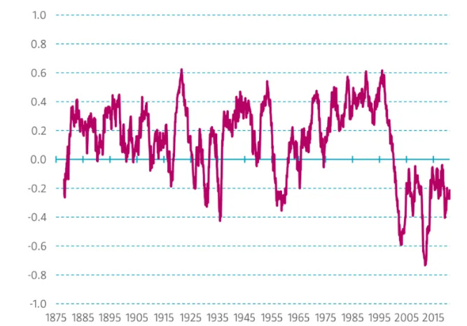
Figure 7: S&P 500 Returns Were Decent in Nominal Terms, Poor in Real Terms

Figure 8: High Inflation Rates Nullified the S&P 500’s Climb

Thus, the regime change starting in 1974 was characterized by switching stock-bond correlations, higher inflation, and lower real equity returns.
High Volatility Period 2: Starting in 1987
The 1980s started with high inflation, a recession, and extremely high interest rates. In 1982, volatility narrowly avoided hitting the 90th percentile mark. Then, from 1982 to 1987, the markets rallied (Figure 9), inflation fell (Figure 10), and yields declined (Figure 11).
Figure 9: S&P 500 Went on a Tear in the Mid 80s
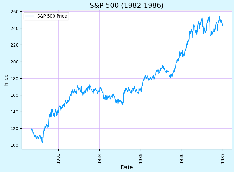
Figure 10: Volcker’s Resolve Brought Inflation Down
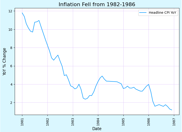
Figure 11: As Inflation Steadied, Rates Declined

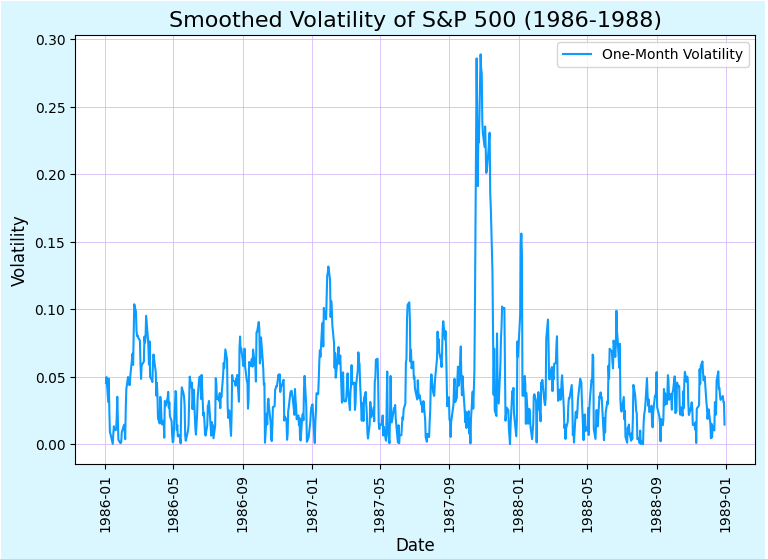
Then, seemingly out of nowhere, Black Monday happened. The market dropped by over 22% (Figure 12). However, the 1987 jump in volatility did not really lead to a regime shift. Stocks and bonds continued rising in the aftermath of the drawdown (and stayed correlated). The spike in variance was rather quick and retreated as fast as it came (Figure 13). Thus, I believe the strength of volatility as a predictor of regime changes is still evident here—no true regime change occurred, but volatility also wasn’t persistently high during this period.
Figure 12: Black Monday Led to a Short Rise in Volatility

Figure 13: Despite a Huge Drop in the Market, Vol Quickly Retreated
High Volatility Period 3: Starting in 2001-2002
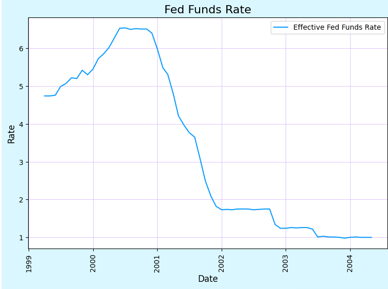
The late 1990s were characterized by a tremendous boom in internet stocks (Figure 14). In early 2000, the rise of unprofitable tech came to a screeching halt with several “dot coms” going under. High volatility characterized the early 2000s as internet and telecom companies went bust, 9/11 rocked the Western world, and Greenspan lowered interest rates tremendously fueling the beginning of the real estate bubble (Figure 15).
Figure 14: NASDAQ Climbed Throughout the Late 1990s

Figure 15: Fed Funds Collapsed as Greenspan Tried to Rescue Markets
In response to the lowering of interest rates, the real estate market began to heat up (Figure 16). In effect, Greenspan replaced the dot-com bubble with the housing bubble.
Figure 16: Home Prices Took Off in Response to Lower Rates

High Volatility Period 4: Starting in 2008-2009
And then, the financial system broke… Real estate prices plummeted (Figure 17), banks failed (Figure 18), and volatility spiked (Figure 19).
Figure 17: Real Estate Values Crashed, Leading to Destruction Across the Financial System
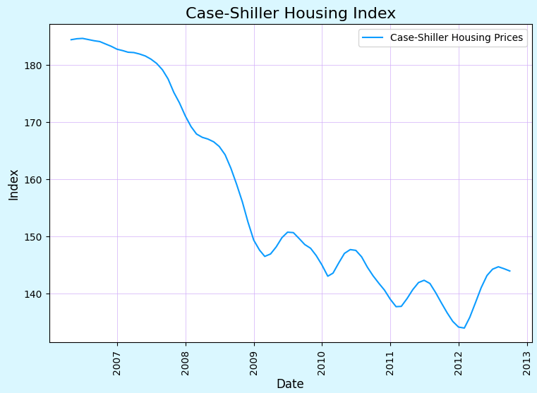
Figure 18: As Real Estate Values Fell, the Banking System Almost Collapsed

Figure 19: Volatility Spiked During GFC

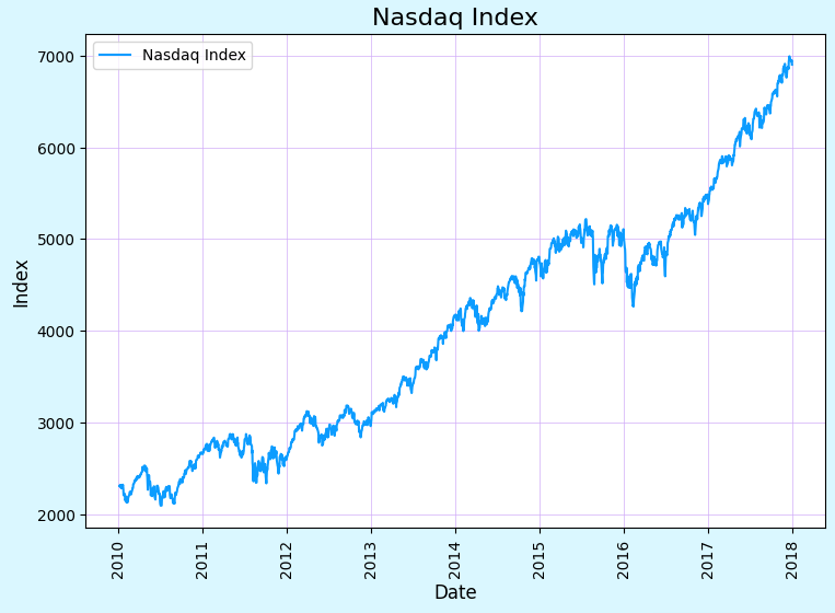
In response, the Fed lowered rates to zero and kept them there for ~ 8 years (Figure 20), fueling the boom in tech (Figure 21), crypto, and various unprofitable ventures.
Figure 20: The Fed Cut Rates to Zero, Kept Them There

Figure 21: Tech Soared with Rates at Zero
During this market regime, traders did well by betting on the worst and riskiest assets. With the Fed keeping short rates low and suppressing long-term rates via QE (Figure 22), high yield did better than investment grade, growth did better than value, private equity did better than public equity, and venture capital performed extremely well. Wealth inequality generally went up and investors made fortunes while the real economy took a long time to recover. Inflation remained stubbornly low and growth was also lackluster (Figure 23).
Figure 22: QE Was a Massive Tailwind for the Riskiest Investors
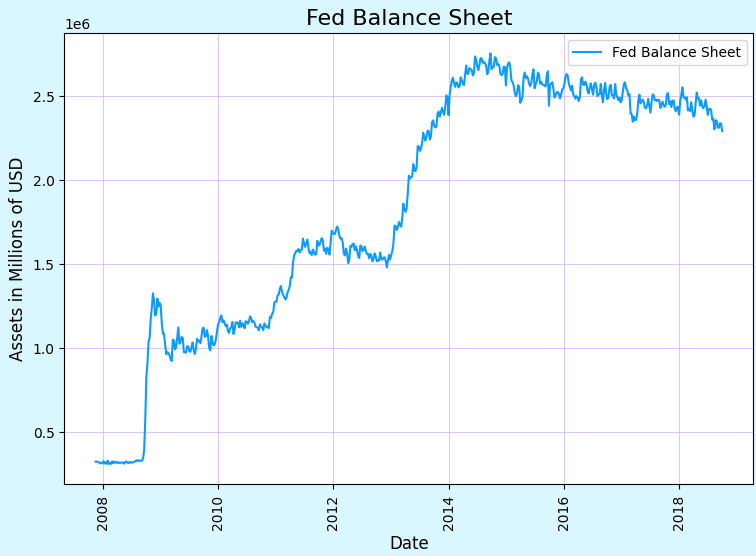
Figure 23: The Real Economy Suffered with Low Growth and Inflation

High Volatility Period 5: 2020-2022
Then, in 2020 everything changed with the onset of the COVID-19 pandemic. In March 2020, the economy shut down, markets collapsed, and liquidity disappeared (Figure 24). In fact, liquidity ran so dry that despite the 10-year treasury usually being a “safe-haven” asset, it was sold heavily for a few days causing yields to spike, a phenomena studied well here (Figure 25). Volatility shot up and remained high for two years as the market looked to digest the consequences of the pandemic (Figure 26).
Figure 24: Equity Markets Fell Dramatically as the Economy Screeched to a Halt

Figure 25: Liquidity Collapsed During March 2020

Figure 26: Volatility Spiked and Remained High for Two Years

We are only just now settling into the post-pandemic regime. Just as past regimes were characterized by shifting correlations, returns, and risks, the post-pandemic period has its own unique structure. Because we are in the early innings of this new regime, I believe it’s up to discretionary investors to figure out the path forward.
I’ve previously given my views on the direction of rates, growth, and inflation over the coming year. I believe we are entering a regime characterized by the following factors:
Fueled by the push online/Zoom during COVID
Fueled by the low interest rates in the post-GFC regime that enabled massive investment in AI and tech
A byproduct of higher productivity and stronger growth
Partially a response to higher government deficits during the pandemic
Related to productivity
Higher productivity will help bring inflation down
Reshoring, deglobalization, and demographic factors will push costs and inflation up
The post-pandemic regime will be characterized by the battle between these two factors
Government deficits ballooned during the pandemic and look likely to stay elevated
The aftermath of the government’s stimulus check program (and massive debt) may make the Treasury more important than the Fed (and possibly make the Fed subservient to the Fed to enable the government to pay interest on the debt)
We still don’t know what the new post-pandemic economic regime will entail. With volatility dropping across the board, we are likely done with the transition period and we are firmly settling into our new economic environment. As per my Friday post, I believe discretionary investors will outperform systematic investors for the next few years before the relationship flips as more data in the new regime is collected.
Conclusion
Today, I defined the term “economic regime” and built upon the work I did on Friday. I walked through the different regimes from World War II to the present. For simplicity, here they are (with their linkages to each other).
1945 - 1973: Post-War Period
Characterized by relative peace, strong growth, stable inflation, strong equity returns, negative stock-bond correlation
1974-19872: Inflation Shock
Characterized by higher inflation. Higher inflation in response to the 1973 oil embargo led to higher interest rates which eventually led to inflation coming down and the markets rallying
1988 - 2002: Strong Growth, Birth of Tech Bubble
Lower rates helped fuel the internet boom which led to higher productivity and the birth of many industries. Eventually, this led to a bubble, the bubble burst, and the Fed dropped rates
2003-2008: Real Estate Bubble Takes Over from the Internet
By lowering rates dramatically following the dot-com bubble bursting, Greenspan replaced the internet bubble with a real estate bubble. This was a period with ok growth, excessive leverage, and unsustainable real estate appreciation. This bubble almost brought the financial system down with it
2009-2019: QE Mania
The Fed kept short-term rates at zero and bought a tremendous amount of long-term bonds in response to the GFC. During this period, some of the worst assets did well: Bitcoin was born, venture capital outperformed, and unprofitable tech triumphed over value stocks.
2020 - Present: Post-Pandemic
The era we are in now. I have my thoughts on how this will play out, but we won’t know for sure for a few more years.
I hope I have proven that economic regimes are characterized by shifting correlations, returns, and risks. They start with a period of high variance as the market attempts to digest what these new dynamics will mean for markets. Each interlocking high variance period leads to the birth of a new regime which plays out and eventually collapses and spawns a new regime. Oftentimes, these regimes start with large drawdowns in equity markets. This makes sense, markets dislike uncertainty and thus sell-off in response to ambiguity. I have thus laid out all of the high variance/economic regimes since World War II and have shown we are likely at the beginning of the next regime.
Thank You!
Thank you for reading until the end. I hope you have a great week and please reach out if you wish to talk more about the Substack.
-Eli
I define high-volatility years as years that had an average monthly volatility in the 90th percentile or greater (~5%) of my sample
I prefer splitting this into 1973-1982 and 1983 - 2000 but I want to adhere to my definitions and models.